| 1. |
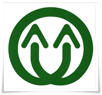
Designed with the word Jhu (Chinese word for bamboo), and the crossing at the bottom forming a road (Chinese word for road is “lu”). |
| |
 |
The shape of the word bamboo represents two or more people, two or more houses, and the East and West regions from the railroad. |
|
The crossing at the bottom of the word bamboo represents humans' interactive relationship, and it is also a symbol of the males and females being together for the reproduction and nurturing of the generations to come. It is a turning point, an overlaying of opinions, and a democratic coordination. |
|
The crossing point is a resting place, which also symbolizes “intersection” or the old “Ban-Lujhu”. It is even more so a connecting point of the roads, which is a starting point and also a terminal point. |
|
Exterior ring forms a circle that shows the active transportation and the web-like road networks within the District. The circle also represents the town people's characteristics of teamwork and harmony. |
|
 |
| 2. |
The complete logo design needs to be connected and drawn using numerous circles; there are big and small circles that represent the multitude of tribes, villages, temples, churches, schools, community groups, farming and industrial products. The circles also symbolize people's many preferences and hopes. The big circle at the outer ring displays the harmony of opinions in unison. The circular shape further exhibits Lujhu District people's persistent spirit. |
|
| 3. |
The single color represents the characteristic of being healthy, open-minded, outgoing, and lively, creating a bright future with an optimistic and positive attitude. |
|
| 4. |
The smiling face is the conclusion of the overall logo design. If people are treating each other with a smile and dealing with everyday affairs with a smile, then an open-minded, united, and peaceful Lujhu District is not far from reach. |
|